Good Design and Bargains
As you consider those black Friday deals, consider this: Often as not, digital controls are just bad interface design foisted off on you to save design complexity– at added cost. Knobs are not obsolete just because we have microcontrollers that can be stuck into anything and configured in software–any more than doorknobs are obsolete because we have automatic doors, or wheels are extinct because we have robot dogs from Boston Robotics.
Sure, sometimes those little buttons buried under plastic are easier to clean, and sometimes (like on my dishwasher) they might be close to as simple to use. They are rarely however superior, and seldom worth paying extra for.
Very often, they are just annoying little beepy things you waste snippets of your life poking at when you could have just set the time (or temp, or both), hit “Start” and gotten on with living.
This is good design:
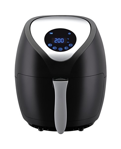
This is poor design:
You might like the pretty LEDs — and that’s fine. Personal taste is a completely different matter, and you are entitled to your own. But from a design perspective, the correct way to set a temperature within a narrow range is with a knob (or slider). It’s quick, intuitive, and easy. The correct way to set an interval within a confined range is also a knob (or slider), and for the same reason. If you NEED to program your air fryer to turn itself on a week from Tuesday at two in the morning, that changes things. But you don’t. And if you need to keep splatter out of the controls, that’s different too, but unless you’re cooking chicken fingers inside a slaughterhouse, that’s probably not the case either. Requiring the user to repeatedly press hard-to-read, hard-to-press, buttons to set things by increments that could be set in an instant with a knob–indeed, with hardly a thought or glance–is poor design. And making the buttons beep annoyingly because they are so hard to press the user won’t otherwise know if they HAVE been pressed, is also poor design.
Products are designed like this for two main reasons. First, slapping a microcontroller into the mix solves a lot of design issues of no importance at all to the consumer. Control issues can be worked around in software instead of through competent engineering. Multiple products can be internally identical with just software tweaks and the outer case distinguishing them. Second, many consumers think (or designers think you think) that knobs are old-fashioned. You, of course, are smarter than that.
I don’t need to open my front door or turn on the coffee pot with a smart phone app. If doing so gives you the jollies, good for you; now go away. For the rest of us, I just want to throw my toast in a slot, hit a knob, and get toast. I do not, under any circumstances imaginable, want the toaster to have a display screen OF ANY EFFING KIND. I want to toss dumplings in an air fryer, twist the timer to something close to the right number of minutes for the same temp I normally use, and find dumplings waiting after the salad is ready. I do not want my dishwasher to connect to the Internet, my smartphone, or the fancy new litter box for some reason. And I do not want anything I didn’t marry or bring into this world to talk to me–ever–so don’t even think about voice response.
We live in an age of wonders, but we live in an age in which anyone with a computer and a credit line can design products and get them made. That isn’t always a good thing. You might think this is just me bitching about a personal peccadillo, but product design is a well-established science, one I have studied quite seriously over the years in my roles in software engineering. We live in a world so awash in bad design, we often forget to look for better solutions.
Bad design wastes money and time, it annoys customers, even those who haven’t studied human interface design and couldn’t tell you why the thing annoys them. And in extreme cases–like when idiots put a pull handle on a door you are meant to push to exit in an emergency because it looks better–it can even get people killed.
So demand better.

